CARPOOLWORLD
PROJECT OVERVIEW
The owners of the product - Carpoolworld.com came to Rutgers with a problem stating that they wanted to better design their product to increase user retention rate and create increased user engagement online.
Carpoolworld helps match users for their transporting needs. It matches drivers and carpoolers based on source and destination as well as has corporate collaborations to enable easier transportation for employees to and from work.
TEAM MEMBERS
Pooja Gurudatt - UX Designer, Researcher, Tester
John Reda - UX Designer, Researcher, Tester
Brittany Norwicki - UX Designer, Researcher, Tester
MY ROLE
UX Research, UX Design, Product Design, Information Architecture, Branding, Identity.
Note to add: I did independently work on this after the semester to enhance some features, deliverables and add more design elements to the project
TIMELINE
3 months [June 2018 - August 2018]
PROBLEM STATEMENT
The clients wanted to revamp their web application and also provide a mobile centric experience for their corporate clients. They pressed on the need to collect user data seamlessly, retain their customers and also provide value via great user experience.
How can we improve user signups on the product? How can we retain old and gain new users? How can we revamp this product to make it mobile friendly while still being user centric in its design? How can we collect user data while also making this product exceptional?
THE OBJECTIVE
Research existing product, conduct UX research not only for users but also their clients, strategize how to attain business goals using UX best practices by providing a prototype.
I aimed to reduce redundancy, streamline booking process, increase user signups and rate of re-entry.
THE DESIGN PROCESS
1. Discovery Stakeholder Meeting
Stakeholder Interviews
Problem Definition
The Objectives
2. ResearchUser Surveys
Desk Research
Heuristic Analysis
User Research
User Interviews
3. IdeationBrainstorming
Priority Mapping
User Flow Definition
4. DesignSketching
Storyboarding
Wireframes
Prototype
UI Design
5.TestingUsability Testing
A/B Testing
Moderated User Testing
PROJECT SUMMARY
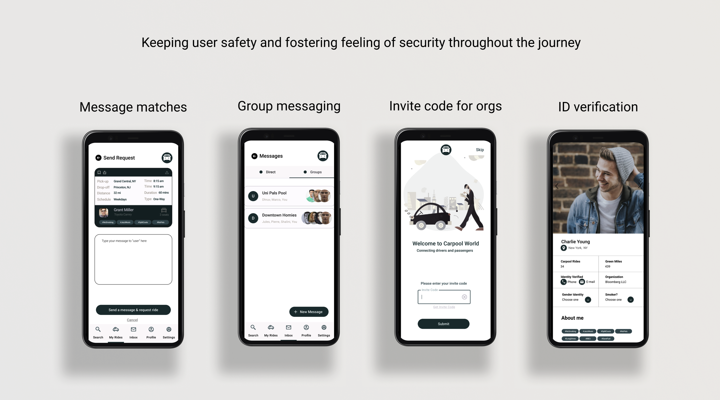
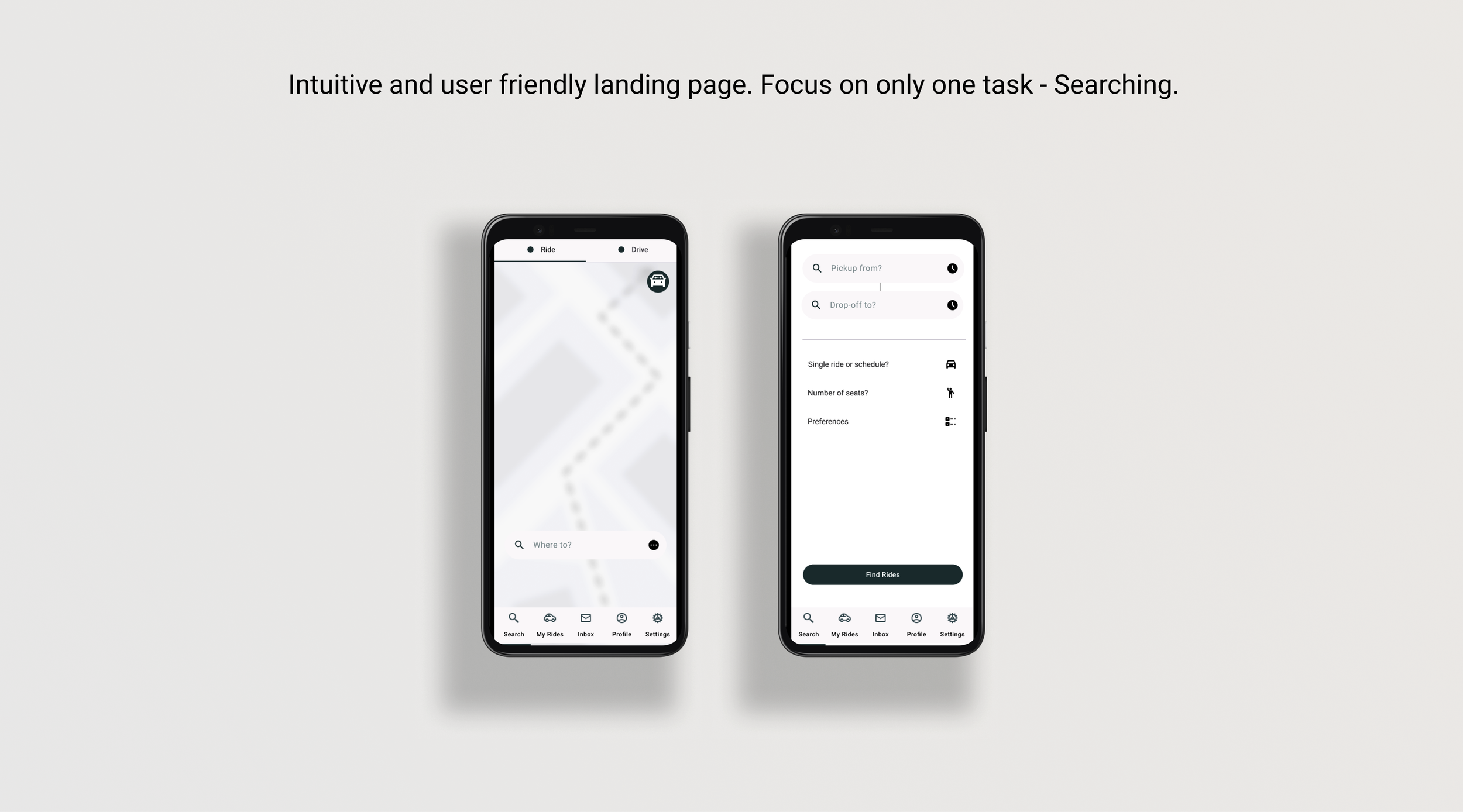
Here are the final features and solutions the team has crafted to best help the CarpoolWorld.com clients in the given timeframe and with all constraints and objectives in mind. Please have a look at the below images for the summary.
THE PROTOTYPE
THE OUTCOMES
Successfully translated our designs into a working prototype and handed off to the founders. Here is what happened next:
We helped Carpool world save over 1 million $ USD in YOY expenses!!
Ideas were immediately implemented into webapp
Mobile app is being built by developers.
Let’s Explore the Process!
Let’s deep dive into the design process to see how I made this product come to life with the following steps:
Discovery: Stakeholder Meetings, Stakeholder Interviews, Problem Definition, Defining Objectives.
Research: User Surveys, Desk Research, Heuristic Analysis, User Research, User Interviews.
Ideation: Brainstorming, Priority Mapping, User Flow Definition.
Design: Storyboarding, Sketching, Wireframes, Prototypes.
Testing: Moderated user Testing, Usability Testing, A/B Testing.
Stakeholder Meetings & Interviews
They have collabs with corporations to get employees to carpool to and from work
Website is very old and needs to be updated
They provided us with a mobile wireframe to refer and improvise designs
Are there any government incentives we can utilize?
Need to translate web app to mobile
Problem Definition & Forming Objectives
Problem Definition: The clients wanted to revamp their web application and also provide a mobile centric experience for their corporate clients. They pressed on the need to collect user data seamlessly, retain their customers and also provide value via great user experience.
Objectives: Research existing product, conduct UX research not only for users but also their clients, strategize how to attain business goals using UX best practices by providing a prototype.
I aimed to reduce redundancy, streamline booking process, increase user signups and rate of re-entry.
Desk Research
The US Government gives its carpoolers tax benefits!
Companies have priority parking for employees who carpool
Driving on HOV lanes during rush hour is a great perk
User Research
12 participants (as of june 2018) to google forms survey
75% never carpool
53% women and arrive stressed to work
60% prefer carpool > public transport
User Interviews Insights
Social Anxiety was biggest barrier to talk online
Surveys on webapp were too lengthy for users
Most prefer using their mobile for all needs
Cost was the biggest factor for carpooling
Heuristic Analysis Research
CTA not on landing page
Ambiguity during user signup process
Information not organized and presentable
Webapp not mobile friendly
Irrelevant data being displayed and confusing users
Ideation
Lots of data, research points and information gathering was done to go to Ideation stage of the journey. On a tight schedule of 3 months and zero spend budget, we had to think of how to ideate and execute this project successfully.
Conducted brainstorming session with team
Defined design ideas and categorized them on priority
Debated about if we should design for web or mobile only?
Wondered how to measure KPIs with short timeline?
Ideated user journey from start to end of product use
Brainstorming : Whiteboard method
I did the whiteboard design challenge method to generate as many design ideas as possible. I came up with quite a few ideas that were implemented as well. We will see more on that as we explore.
I divided the board into 4 parts :
Empathize: gives the context, constraints, research points collected.
Define: What’s the problem? Persona and current solution.
Ideate: To think of key features and approx user flow.
Design: Quick sketch of what I would include in the design.
Priority Mapping
Taking into consideration the time restraints, resources restraint and business needs and user priorities, I mapped out the design ideas into what we can and cant do. I used the priority map to help focus on what is the need of the hour.
Top takeaways from this exercise
Users want shorter onboarding
Need clear CTA on landing page
Translate the web app into mobile
Remove user poll fatigue
Structure the flow and information clearly
Encourage users to submit data easily
User Flow Definition
The user flow was defined based on user journey and based on research and data collected previously. I wanted to keep the web app flow and mobile app flow similar.
Sitemap
I created a sitemap with card sort method and mapped out all the features and what pages they should go onto. We tested these out later in the testing phase as well, so as to best help users navigate with high efficiency.
The Design Phase
-
1. Sketching
I quickly dove right into sketching to put my thoughts onto paper. I considered the 8 grid box method to sketch out my designs. I then filled in the rest of the boxes with different actions for different stages of user journey.
Sketching helps when I want to immediately put my ideas onto paper and also for rapid testing or prototyping while discussing with the clients.
-
2. Wireframes
I initially used marvel app online to wireframe but decided to use miro and figma later on to create more cohesive and quicker wireframes. This phase helped show the clients some changes after rapid prototyping, make necessary changes and continue refining the designs.

-
3. Prototype
I decided to use any basic available design system online (in this case, I decided to use Material UI) and stick to black and white (mostly neutral) color scheme to better communicate how these designs will benefit not only users but also the business eventually. Initially used marvel apps to design but later switched to Figma as it was quicker and easier.

The PrototypeTesting
Once the wireframes were produced and we could make it into a clickable prototype, usability testing was done to get real time feedback and observe how users interact with the system.
MODERATED & A/B TESTING
Testing Observations
Users preferred the flow on webapp more but wanted to use mobile
Direct CTA was a hit and improved task completion rate
100% users would now try to carpool if they have this service available to them
Users wanted to have the feature to create advance trips and book rides
One click survey increased user data collection by 100%
90% users completed tasks successfully
User confused by CTA button wording on landing - We must change to non-commitment language instead.
There is no need to re-invent the wheel, but just enhance it
The Final Outcome
Successfully translated our designs into a working prototype and handed off to the founders. Here is what happened next!
We helped Carpool world save over 1 million $ USD in YOY expenses!!
Ideas were immediately implemented into webapp.
Have been honorarily mentioned for my contributions on their product live online.
Mobile app is being built by developers.


