


YALE SCHOOL OF ARTS
PROJECT OVERVIEW
Yale school of arts is a website aimed at prospective, current and alumni students as well as caters to faculty. It showcases their courses, student work, alumni events, news happening on campus and various admission processes and details.
TEAM MEMBERS
Individual Project - Pooja Gurudatt
MY ROLE
UX Research, UX Design, Information Architecture, UI Design
Note to add: I did independently work on this after the semester to enhance some features, deliverables and add more design elements to the project.
TIMELINE
3 months
PROBLEM STATEMENT
Yale School of Arts seeks to enhance its website to facilitate users in efficiently accessing information, navigating web pages, evaluating available courses, and enrolling in their diverse range of arts programs. The website exhibits poor usability with a confusing navigation structure, disorganized information that is not readily accessible, numerous dead-end links, an outdated design, and a lack of both search and navigation systems. User-friendliness is rated at zero.

THE OBJECTIVE
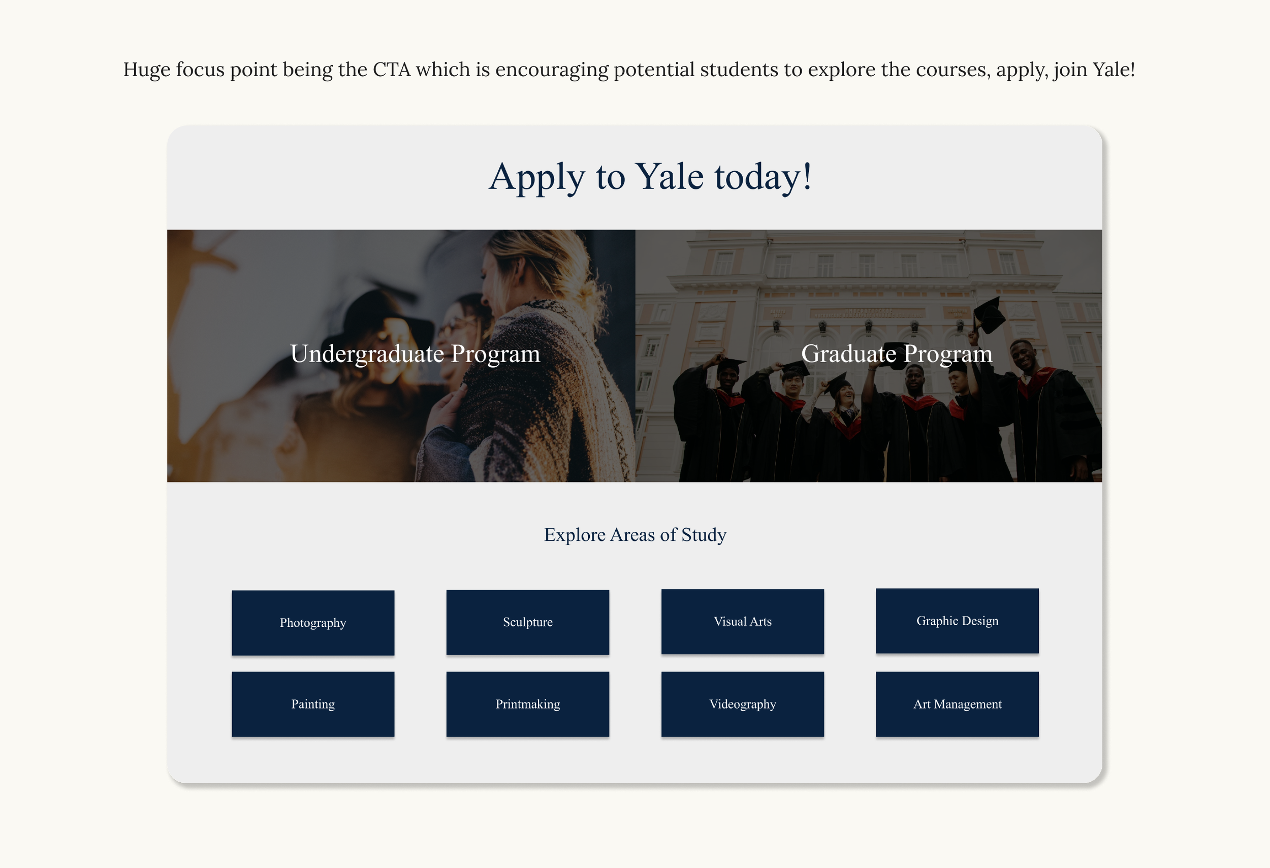
To revamp the Yale School of Arts website through an in-depth exploration of its framework, comprehensive research about the university, usability analysis, and information architecture enhancements, resulting in a redesigned layout and navigation system. This project aims to provide the website with a refreshed and modern interface, ultimately increasing web traffic and enrollment to college programs. Our goal is to prioritize user-centric designs, ensuring that the website becomes highly user-friendly and responsive to the needs of its visitors.
THE DESIGN PROCESS
1. Discovery Website Analysis
Desk Exploration
Problem Definition
Objectives
2. ResearchContent Assessment
User Research
Competitive Analysis
3. TestHeuristic Testing
Tree Testing
Stress Testing
4. DesignWireframes
Prototyping
PROJECT SUMMARY
Here are the final features and solutions the team has crafted to best help the Yale University in the given timeframe and with all constraints and objectives in mind. Please have a look at the below images for the summary.


THE PROTOTYPE
THE OUTCOMES
Successfully translated my designs into a prototype and handed off to the university professor. This was an individual project and I got inspired to transform products to make them more digitally accessible, make them responsive, add more structure through information architecture and have it be user centric in design.

Let’s Explore the Process!
Let’s deep dive into the design process to see how I made this product come to life with the following steps:
Discovery:
Website Analysis
Desk Exploration
Problem Definition
Objectives
Research:
Content Assessment
User Research
Competitive Analysis
Test:
Heuristic Testing
Tree Testing
Stress Testing
Design:
Sitemap
Wireframes
Prototyping

Website analysis & Desk research exploration
I completed did a heuristic analysis for the current Yale school of arts website to find out several design mistakes, usability issues and accessibility problems.
I also referenced several similarly graded colleges to see what they have to offer that Yale school of arts website lacks and did a comparative note.
A deeper website assessment helped me pinpoint all the changes I needed to make and create improvements.

Problem Definition & Forming Objectives
Problem Definition: Yale School of Arts seeks to enhance its website to facilitate users in efficiently accessing information, navigating web pages, evaluating available courses, and enrolling in their diverse range of arts programs. The website exhibits poor usability with a confusing navigation structure, disorganized information that is not readily accessible, numerous dead-end links, an outdated design, and a lack of both search and navigation systems. User-friendliness is rated at zero.
Objectives: To revamp the Yale School of Arts website through an in-depth exploration of its framework, comprehensive research about the university, usability analysis, and information architecture enhancements, resulting in a redesigned layout and navigation system. This project aims to provide the website with a refreshed and modern interface, ultimately increasing web traffic and enrollment to college programs. Our goal is to prioritize user-centric designs, ensuring that the website becomes highly user-friendly and responsive to the needs of its visitors.
RESEARCH : Content Assessment
Vintage website with jarring visuals and not apparent navigation system.
Search is not present and there is not any structure noticed. No accessibility options.
Information unorganized and scattered data for users. User unfriendly. Zero branding. No aesthetics.

RESEARCH: User Research
Desk research led me to discover the personas of actual students who go to university, the staff who are employed there and potential students.
I crafted the personas for each of these users.
Based on these personas, I designed the user journey.


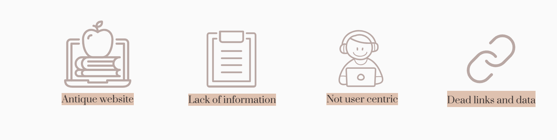
RESEARCH : Competitive Analysis
Strengths of Yale when compared to others : Public awareness & high traffic on sites.
Antique website and not modern or user friendly like other sites.
Disorganized information, bad navigation, bizarre visuals, not accessible.

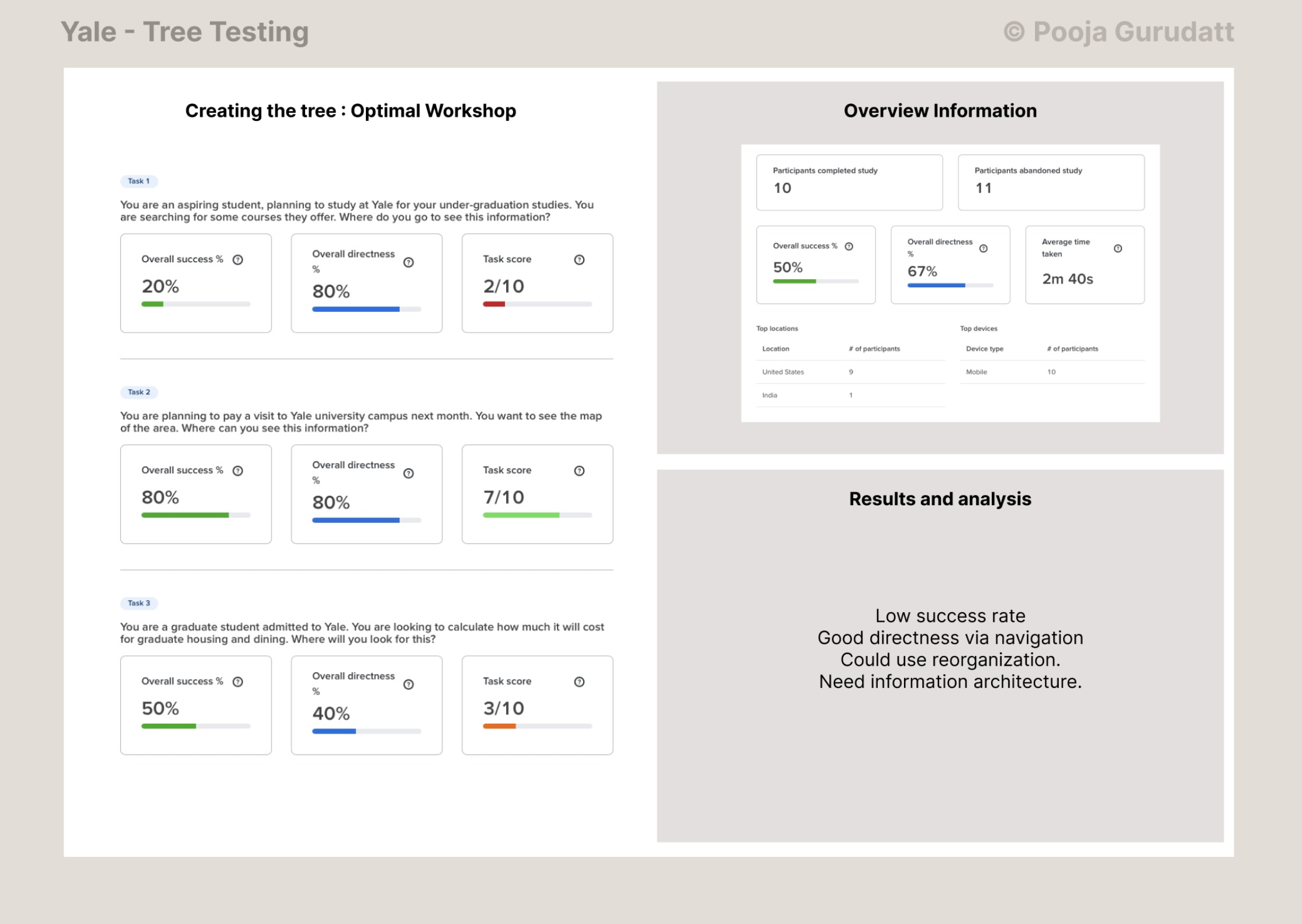
TESTING : Tree Testing & Card Sorting

Tree test using "Optimal Workshop" tool with 10 participants. Only 50% efficiency with old website.
Based on feedback from the tree test, I redesigned the information architecture to better organize data and information and did card sorting with 2 participants.
This resulted in over 90% efficiency!
New navigation was more user friendly and helped reach CTA buttons.
There is a strong need for re-organizing information.
TESTING : Heuristic Analysis

I used Neilson’s Method for the Heuristic Analysis to test out the website against the 10 usability metrics. Here are the results of the analysis in summary:
Major usability issues detected during web usage. It is unusable on mobile.
Lots of cosmetic issues which hinder accessibility and readability, while also confusing the users.
Major issues with no search functionality throughout the site, neither did I find any help or documentation, sitemaps.
Navigation is a painpoint and can be better designed.
Multiple dead links, missing pages, non-working downloadable assets etc.
Login and recovery of account issues render it completely inaccessible.
TESTING : Navigation Stress Test

During the stress test, I noticed a lack of clear navigation indicators, such as breadcrumbs or section labels, making it difficult to determine the current page. While my test subject perceived major sections on the page, I found only the course name and details. Neither of us found links leading to sub-pages or related content. Since I had prior experience with the website, I knew similar pages existed under the “COURSES” section, but my participant, unfamiliar with the site, could not discover them. However, navigation from the homepage to this course page was intuitive, as both of us followed the expected path: Home > Courses > Advanced Graphic Design.
Based on these findings, the website requires significant usability improvements to enhance user comprehension and navigation. A clearer navigation system, better information structuring, appropriate labeling, and improved visual and spatial design will greatly improve the overall user experience. Implementing these features will make it easier for users to find relevant content and navigate the website efficiently.
The Design Phase
-
1. Sitemap
With data gathered from the site, navigation links sorted with card sorting method, and with evidence through navigation stress test, I designed the final sitemap for the new version of the Yale arts website.
This sitemap is clear, concise and directly helpful to all visitors.

-
2. Wireframes
I initially used marvel app online to wireframe but decided to use miro and figma later on to create more cohesive and quicker wireframes. This phase helped show the clients some changes after rapid prototyping, make necessary changes and continue refining the designs.

-
3. Prototype
I decided to use any basic available design system online (in this case, I decided to use Material UI) and used the Yale brand colors and brand assets. Initially used marvel apps to design but later switched to Figma as it was quicker and easier.
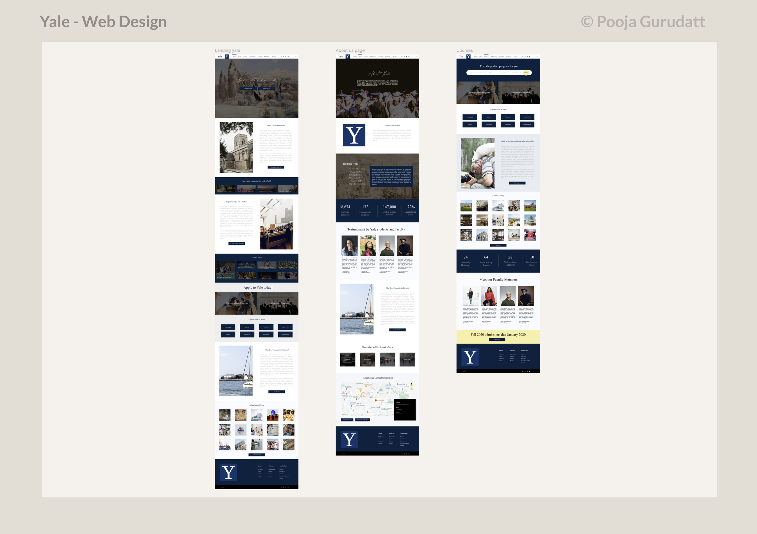
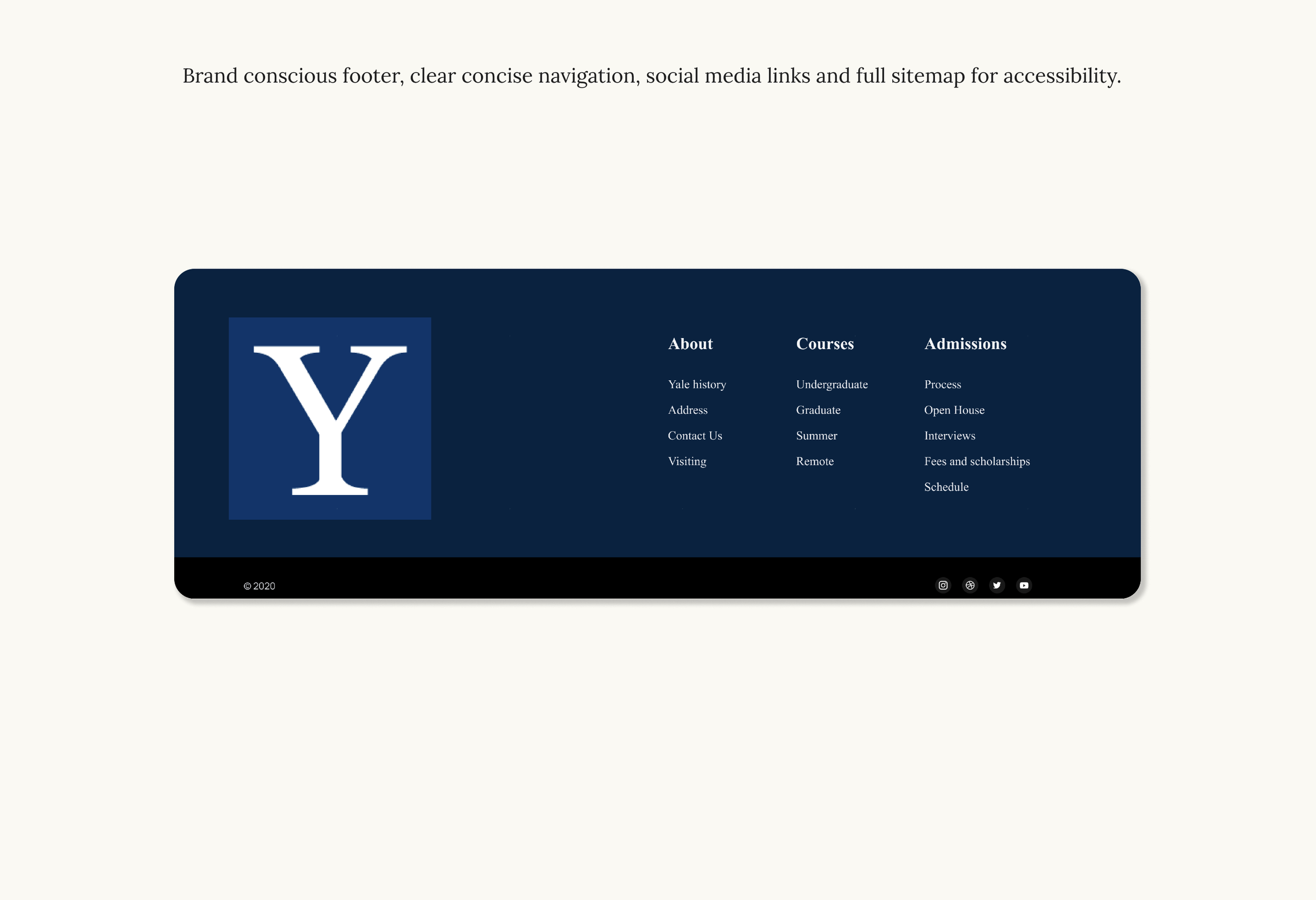
The Prototype